
By Stephen Fisher and Dan Snow.
On average the polls have had a fairly consistent and comfortable lead for the Conservatives in this general election campaign. However, around that average there are substantial differences between polls. Some suggest the Conservatives might fail to win a big enough lead to secure a majority, while others point to a Tory landslide with a majority over a hundred. What’s going on?
In short, since this is a long and complicated blog, our tentative conclusion is that the big systematic differences between pollsters are due primarily to systematic differences in the kinds of people they have in their samples, even after weighting. Some of the sample profile differences translate straightforwardly into headline differences. For instance, having more 2017 Conservatives in a sample means there will be more 2019 Conservatives. In other areas there are more puzzling findings. Polls vary in the extent to which women are more undecided than men and in the extent to which young adults are less certain to vote, but neither source of variation has the effect on headline figures that we would expect. Nonetheless for most of the aspects of the poll sample profiles we have inspected, it is remarkable the extent to which polls differ primarily between pollsters, with relatively little change over time for each pollster. This suggests that the way different pollsters have been going about collecting responses has yielded systematically different kinds of respondents for different pollsters. With a couple of exceptions, it seems as though it has been the process of data collection rather than post-hoc weighting and adjustment that may be driving pollster differences in this campaign.
As the graph below shows, a large part of the variation between polls is between pollsters. The pollsters have shown a similar pattern of change in the Conservative-Labour lead over time, most with a peak in mid-November and a slight decline since. The headline Conservative-Labour lead – the basis for the swingometer – is the main guide to seat outcomes. So an important question is why pollsters differ systematically in the size of their published Conservative leads.

In this blog post we use data from the standard tables that pollsters have to publish as part of the requirements of British Polling Council membership. They contain a wealth of information about the profiles of the different survey samples both before and after weighting and adjustment. We collected data from such tables for all polls between the 30th of October (when parliament voted for an early general election) to the 4th of December (just over a week before the end of the campaign). There have been more polls since then but so far as we can tell they do not substantially change the issues we raise here.
The standard tables are unfortunately not standardised across pollsters – some present different information from others. As a result, not all of the analyses below include all pollsters. Also because of the nature of the tables, we focus on the Conservative share of the two-party vote. This is extremely highly, but not perfectly, correlated with the published lead. We typically present graphs with the most recent poll for each pollster from our collection, but we have checked our conclusions with regression models which use most of the polls from the campaign and which control for time trends and other factors. Still, our findings and suggestions are preliminary and tentative, and not intended as criticisms of any pollster. Nor are there any arguments that should be read as endorsing any pollster or predicting which will eventually be more accurate.
One approach to identifying the sources of pollster differences is to try to link differences in headline figures to differences in methodology, as for instance Mark Pickup and others did for 2010. There are some important methodological differences we should note: Kantar’s historically informed turnout model; phone polls by MORI and Survation; MORI’s abstinence from past vote weighting; and variation in the use of candidate lists. These features do seem to contribute to headline differences, but it is also true that there are substantial differences between pollsters that are apparently using rather similar methods (see the helpful guide from Anthony Masters). For this reason, and because we are also interested in what’s going on within polls, and the lessons for voting behaviour, we have to look under the bonnet at different aspects of the polls and how they relate to the eventual published lead.
We start by considering the extent to which variation in the Conservative lead between polls from different pollsters is due to differences in the underlying raw unweighted data. In 2015 both the published and the unweighted raw data showed the two main parties tied, but the Conservatives won with a 7-point lead. The graph below shows that those polls and pollsters who are publishing better vote-intention figures for the Tories are doing so in large part because they are starting with samples with relatively more Conservative and fewer Labour voters. It is also noticeable that for most, but not all, polls and pollsters the effect of weighting and adjustments between the raw data and the published data is to improve the Conservative position relative to that of Labour. Both of these patterns are similar to the 2017 experience, when there was an increase of the Conservative lead from that in the unweighted data to that in the published figures. On average in the final polls for 2017 there was a one-point Conservative lead in the unweighted data but an 8-point headline lead (Curtice, LSE 2019).

Some of the above variation may be due to haphazard social and political differences between raw samples. Pollsters weight their samples to make them more representative of all adults in Britain both socio-demographically and (with the exception of Ipsos MORI) politically with respect to voting in 2016 and 2017. The relative strength of the Labour and Conservative vote is more similar between the published and all-GB weighted figures than between the published and weighed data, as the graph below shows. The published and all-GB weighted Conservative. Three-quarters of the variation between polls and over half the variation between pollsters’ average Conservative share of the two-party vote as published is due to variation in the Conservative share of the two-party vote in the all-GB weighted samples. That means published figures differ primarily because they are based on different samples with different levels of support for the parties, not because of methodological differences in what pollsters do to the data after collection.
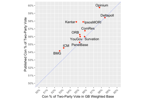
Before examining that proposition in more depth, it is worth noting that the effect of further adjustments and turnout weighting typically extends the Conservative lead by a point, and rarely reduces it.
Former Labour and Conservative voters
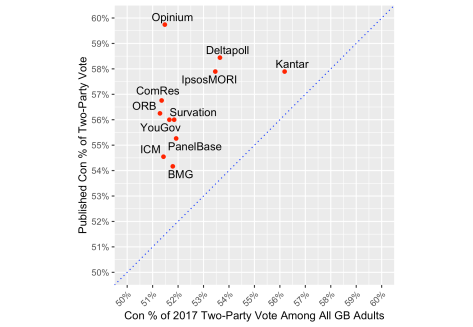
Earlier this year Anthony Wells presented some analysis showing that, among YouGov panel members, those who voted Labour in 2017 are now less likely to report their previous party choice, unlike former Conservative voters. Kantar have since presented supporting evidence (Williams, LSE 2019). One response to that situation is for pollsters to adjust their targets for their 2017 vote weights. Some signs of this are visible in the graph below, with Deltapoll and especially Kantar weighting to higher Conservative shares of the 2017 vote. Those methodological choices are associated with higher published Tory leads, as would be expected. Despite having published the original research on this issue, YouGov appear to be weighting to a target close to the actual 51.5% Conservative share of the 2017 two-party vote. This is because, with their long standing panel, past-vote recall is often measured close to the 2017 election. We also gather Opinium have a similar approach.
Most Conservative votes at this election will be from those who also voted Conservative in 2017, and the same for Labour. Naturally then, there is a substantial positive correlation between the Conservative share of the 2017 two-party vote among those who are expected to vote in 2019, and the Conservative share of the 2019 two-party vote as published. (It is not so clear from just the most recent poll from each pollster in our collection, but it is clear across the campaign.) This, coupled with the greater variation in the Conservative share of the 2017 two-party vote among 2019 voters than among the all-GB weighted base, suggests that pollsters showing bigger Tory leads at this election do so partly because they expect higher turnout among former Conservative voters than among former Labour voters.
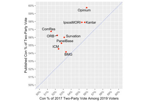
A particularly instructive comparison at this point is between Opinium and Kantar. As we saw above, Kantar weights to a relatively high 2017 Conservative target and that does not change much in the graph below after further weighting for different turnout probabilities. By contrast, Opinium weight to the actual 2017 election result, but after turnout weighting end up with a sample that has rather more former Conservatives than former Labour voters. This is partly because Opinium often finds former Conservative voters are much more likely to say that they are certain to vote than former Labour voters, by an average of 9 points. By contrast, the average gap in certainty to vote between 2017 Conservative and 2017 Labour voters for YouGov polls is just 2 points. There is a lot of variation between pollsters in the extent to which they expect former Conservatives to vote more often this time – and they do all expect that. In truth though, differential self-predicted certainty to vote between former Conservative and former Labour voters does not systematically account for differences in published leads across all pollsters. It is, we acknowledge, a puzzle to try square this with the observations in the previous paragraph.
Balance of Leave and Remain voters, and those who did not vote in 2016
We can ask a similar set of questions about former Leave and former Remain voters as we asked of 2017 Conservatives and Labour. The graph below shows little variation in the target weights for Leave voters relative to Remain. Most weight to 52% Leave, according to the UK result. The GB result was slightly stronger for Leave. Chris Curtis says YouGov have taken account of greater mortality among more Leave voting older cohorts since 2016, but their apparent target Leave share is not much below 52%. Mortality alone will not have reduced the ratio of Leave voters to Remain voters below 50:50 yet, but it will be closer to equality than it was in 2016.

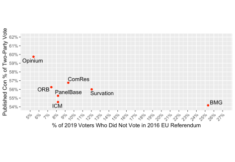
The other side of demographic change is the entry of new younger voters into the electorate. They could not have voted in 2016. But the vast majority of those who did not vote in 2016 were plenty old enough to have voted then. Pollsters, and their samples, differ in how many of those who did not or could not vote in 2016 are expected to vote this time. The figure below shows the spread, with BMG producing strikingly high estimates. (This is partly because our working definition of 2016 non-voters is all those who did not say they voted Leave or Remain, which includes some who would not say or can’t remember.) With or without BMG as the outlier, there is a noticeable negative correlation between the expected proportion of 2019 voters who did not vote in 2016 and the published Conservative lead. This is unsurprising given that all polls find that those who did not vote in 2016 are more favourable to Labour.
Undecideds
There are still many voters who have not yet made up their minds. Many commentators have argued that those who are undecided were more likely to be former Labour voters or otherwise favourable to Labour, and so would be likely to eventually vote Labour. But rather than a decline over time in the numbers of undecided voters, there is more systematic – and stable – variation between pollsters than there is a trend. Estimates for the proportion of voters who are undecided range from 5% (typical of MORI polls) to 15% (in Survation and Opinium polls). But even though pollsters agree that former Labour voters and Labour supporting groups are more likely to be undecided, there is surprisingly no correlation between the percentage of undecideds in a poll and the headline lead. In truth there are some differences in the base (all-adults versus possible versus likely voters) for the % Don’t Know figures. But from what we can tell from where we can trace the numbers across different bases, that problem seems to be irrelevant to the absence of a clear correlation across pollsters between the frequency of undecided voters and the published lead.

One of the particular suppositions about the undecideds is that they will break towards Labour because they are mainly (younger) women. It is true, as at the last election, that women are more likely to say that they don’t know whom they will vote for. They are also more likely to vote Labour. This pattern would suggest that polls with a greater gender gap in the rate of Don’t Know responses are likely to show a lower Labour vote and so a relatively higher Conservative share of the two-party vote. The graph below, and further analysis, shows the opposite is true of variation between polls and pollsters. We don’t know why, but the fact that the pollsters differ substantially in their estimates of this gender gap does reinforce our point that they have rather different samples.

Age and turnout gaps
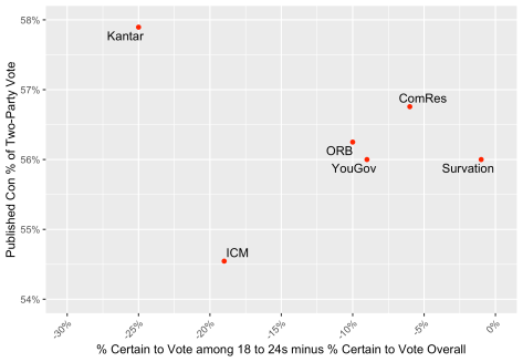
A key issue with the failure of some of the polls in 2017 was overestimation of the extent to which young people would vote. Pollsters again vary in the extent to which they expect young adults to turnout at the same rate as others. The graph below shows how the Conservative share of the two-party vote in the published figures varies according to the gap between the percentage of 18-24 year olds saying they are certain to vote and the equivalent figure for the whole population. (This measure is highly correlated with average self-declared turnout probabilities, but easier to identify from standard tables.) Kantar, who use a different survey question with fewer response options than the usual 0-10 scale, show the biggest age gaps. One Survation poll shows nearly no gap. Most pollsters find that the percentage of 18-24 year olds saying they are 10-out-of-10 certain to vote is about 10 points lower than the equivalent figure for the average respondent. However, unlike with many of our other analyses, there is considerable variation between polls for any given pollster. There is also relatively little sign that the size of the self-declared turnout gap between different ages helps explain variation in the headline lead. On the contrary, it is more remarkable for some pollsters how insensitive the published lead is to age gaps in certainty to vote. The same is true of self-declared turnout gaps between 2017 Conservative and Labour voters (as noted above), between Leave and Remain voters, and between those intending to vote Conservative and Labour.
Conclusion
The variation between pollsters we observe above may yet change before the election, especially since the final polls often involve methodological changes. But any such changes would need to be considerable for there to be little variation between the final polls. So doubtless there will be important lessons to be learned after the election from the different experiences of different pollsters. This blog makes a start in that direction.
As we said above, our conclusions are tentative, but our analysis so far suggests that the substantial differences between the published leads from pollsters are due primarily to the different kinds of responses they collect, even though there are other methodological differences in weighting and question wording that also make a difference.
None of this has left us with a clear picture as to which pollster or methodology is best. Since all sample surveys involve some haphazard error, even after the election we probably still won’t know for sure.
Acknowledgements: Thanks to Matt Singh for comments on an earlier draft.
