
The graph below shows the 2013 Projected National Share of the vote (PNS) from the local elections together with previous PNS figures. It shows just how dramatic the change is. This is the first time none of the three main parties in parliament have achieved more than 30%. The Liberal Democrat PNS is the worst on record and the Conservative PNS is equal to its previous worst showing in 1995. Labour’s PNS is worse than at any local elections while they were in opposition in the 1980s and 1990s.
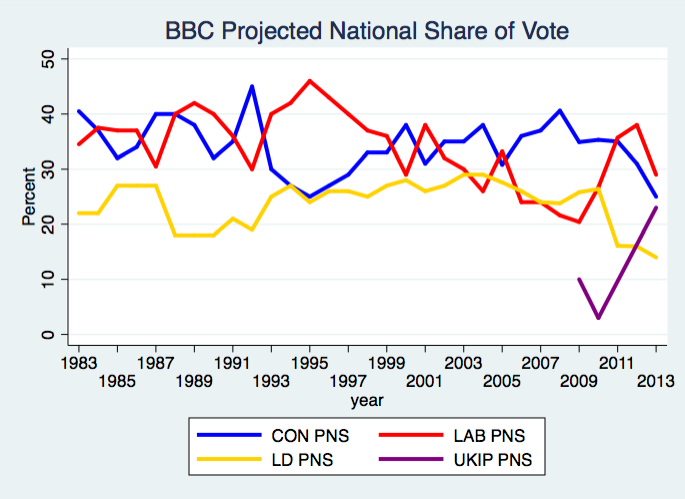
The previous UKIP figures are actually the Rallings & Thrasher NEV estimate of 10% for 2009 and the 2010 General Election share of 3%, (no estimate for UKIP in 2011).
Acknowledgements
Thanks to BBC and John Curtice for the data.
